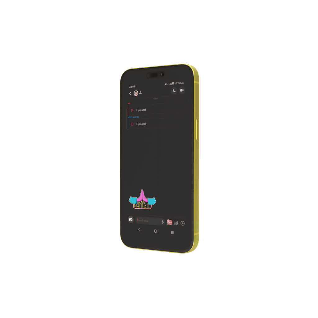
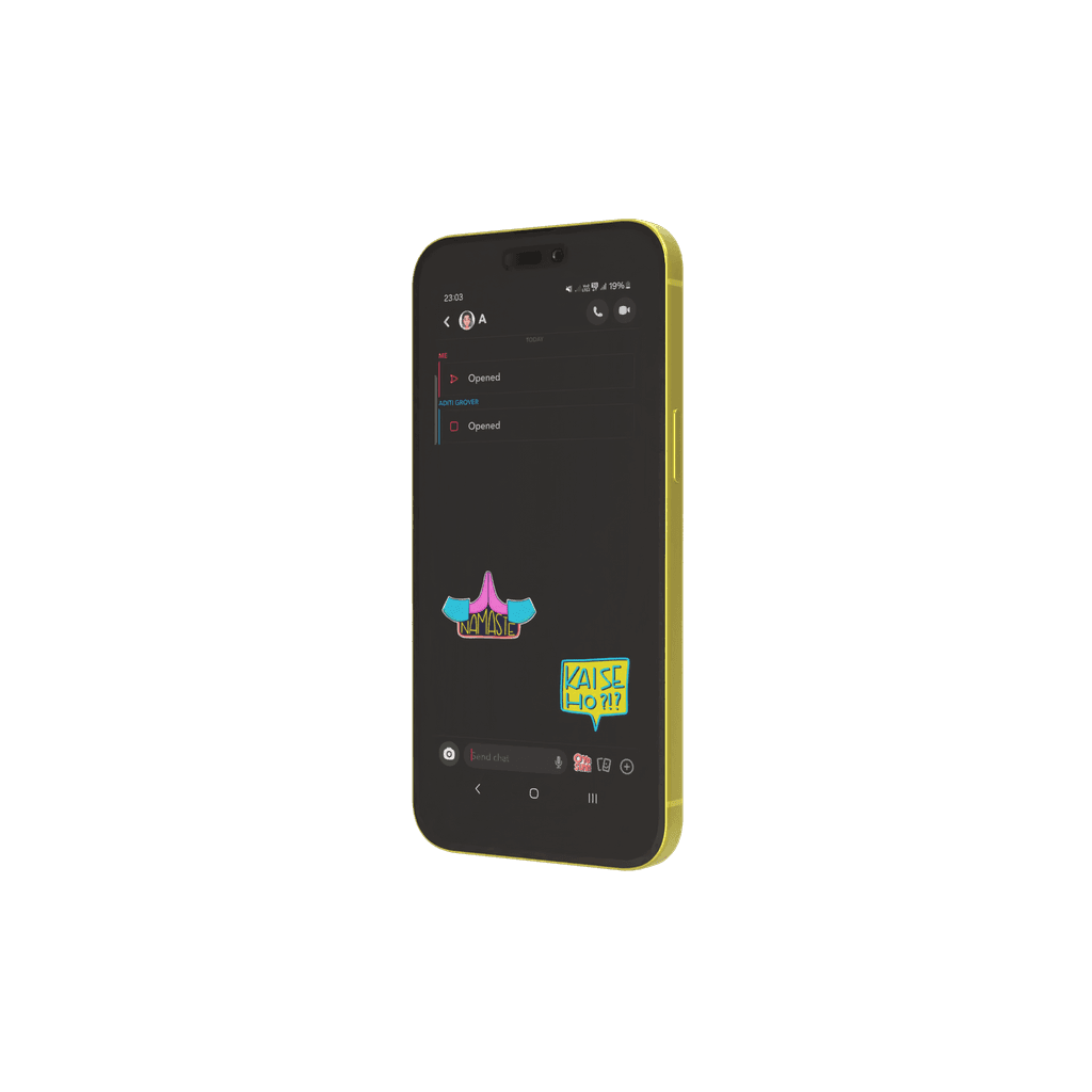
Stickers are now LIVE on Snapchat App

Snap moments
Snap
moments
Snap moments
S
S
S
t
t
t
i
i
i
c
c
c
k
k
k
e
e
e
r
r
r
s
s
s
snapchat
snapchat


Company: Snap Inc. Ltd (Snapchat)
Company: Snap Inc. Ltd (Snapchat)
Company: Snap Inc. Ltd (Snapchat)
Role: Creative Director
Role: Creative Director
Role: Creative Director
Creative Responsibilities: Copywriting & illustration design.
Creative Responsibilities: Copywriting & illustration design.
Creative Responsibilities:
Copywriting & illustration design.
Project Overview:
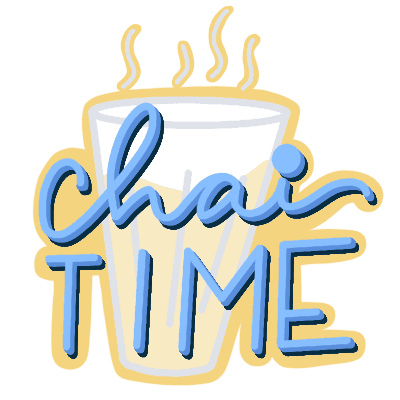
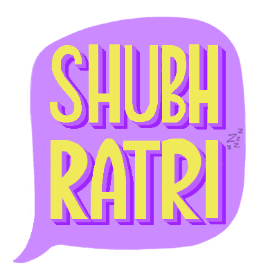
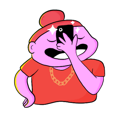
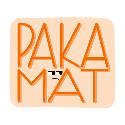
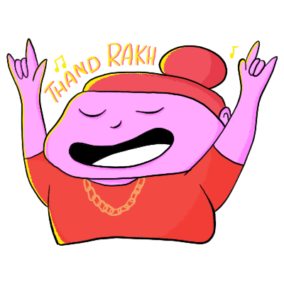
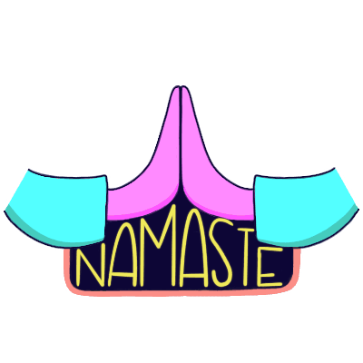
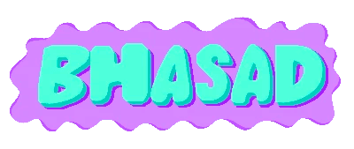
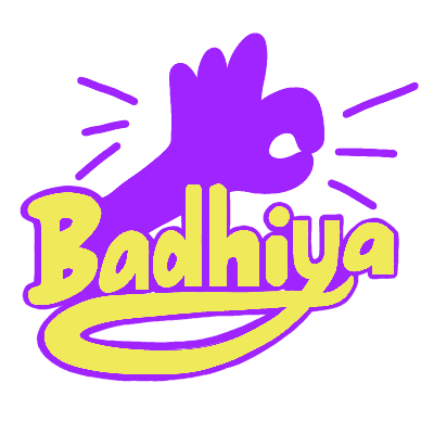
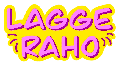
This project explores the creation of Snapchat stickers and filters specifically tailored for the Indian audience. By focusing on cultural nuances such as food, pets, and friendship, the designs resonate with users, celebrating the "mahol" of everyday life in India.
Project Overview:
This project explores the creation of Snapchat stickers and filters specifically tailored for the Indian audience. By focusing on cultural nuances such as food, pets, and friendship, the designs resonate with users, celebrating the "mahol" of everyday life in India.
Project Overview:
This project explores the creation of Snapchat stickers and filters specifically tailored for the Indian audience. By focusing on cultural nuances such as food, pets, and friendship, the designs resonate with users, celebrating the "mahol" of everyday life in India.
Tools Used:
Tools Used:
Due to the project’s success, it led to a longer collaboration with three contract extensions.
The stickers and filters are now live on the Snapchat app, making everyday conversations more relatable and fun.
Due to the project’s success, it led to a longer collaboration with three contract extensions.
The stickers and filters are now live on the Snapchat app, making everyday conversations more relatable and fun.
Snap Stickers
Snap Stickers
Snap Stickers
Snap Stickers
What Challenges I faced:
Balancing cultural authenticity with stakeholder expectations while ensuring the stickers aligned with Snapchat’s brand guidelines.
Bridging the language gap between stakeholders to ensure that the execution flows without any obstacles.
Ensuring stickers remained clear & expressive at smaller sizes through multiple iterations in typography, line weight, and contrast.
What I gained in return:
This project strengthened my ability to translate cultural nuances into engaging visuals while navigating corporate approvals.
Working with Kiblind Agency and Snapchat refined my approach to balancing creativity with brand expectations.
It also deepened my understanding of designing for digital usability, ensuring stickers remain clear, recognisable, and seamless in user interactions.




What steps shaped this project?
What steps shaped this project?
What steps shaped
this project?
1
Research
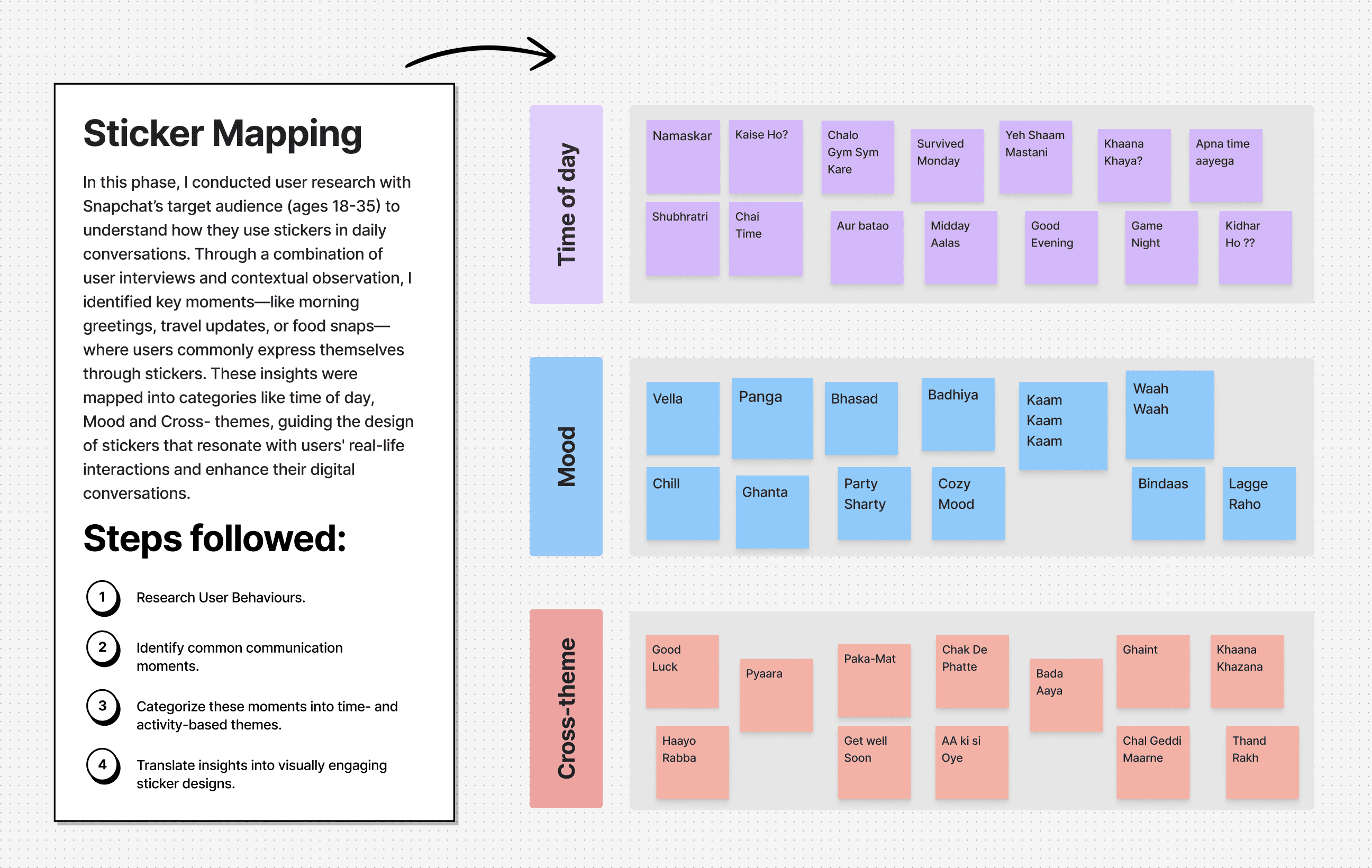
I began by understanding the target audience (aged 19-35) through a deep dive into daily Indian lingo, particularly focusing on what resonates with Hindi and Punjabi speaking Snapchat users. This research informed the categorisation of themes & aesthetics for the final designs.
Research
I began by understanding the target audience (aged 19-35) through a deep dive into daily Indian lingo, particularly focusing on what resonates with Hindi and Punjabi speaking Snapchat users. This research informed the categorisation of themes & aesthetics for the final designs.
2
Concept Development
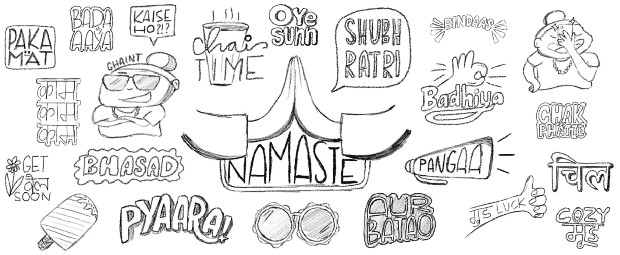
This phase began with initial sketches and mood boards that explored the core ideas for each design theme. I started by creating a set of three stickers to establish the tone and visual style, ensuring consistency across both the stickers and filters.
Concept Development
This phase began with initial sketches and mood boards that explored the core ideas for each design theme. I started by creating a set of three stickers to establish the tone and visual style, ensuring consistency across both the stickers and filters.
3
Iteration
The designs were refined through feedback and consultations with the client. A key piece of feedback was to use non-skin colors like blues and purples for character skin tones to keep them neutral.
Iteration
The designs were refined through feedback and consultations with the client. A key piece of feedback was to use non-skin colors like blues and purples for character skin tones to keep them neutral.
4
Final Deliverables
The final designs were crafted & organised into themed folders. Designs were reviewed twice to meet the project’s goals & was accompanied by a memo explaining the phrases used. This approach ensured that the client received clear, well-organised, and effective designs ready for use.
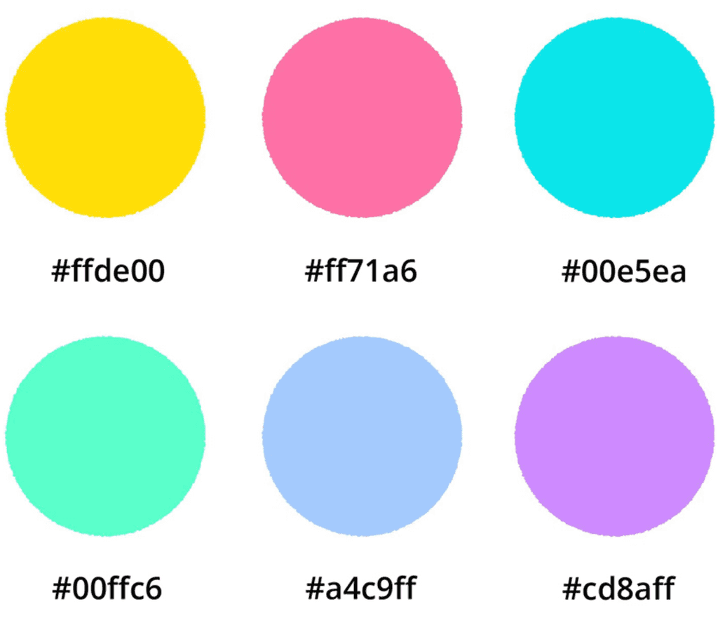
Typography
I chose hand-drawn lines and type to maintain a raw, authentic feel,
reflecting the spontaneous nature of our daily snaps.
Color Scheme
Inspired by Snapchat's vibrant yellow and its energetic vibe, I selected bold, primary colors to match that vibrancy, ensuring the stickers and filters align with the app's lively aesthetic.
Typography
I chose hand-drawn lines and type to maintain a raw, authentic feel, reflecting the spontaneous nature of our daily snaps.
Color Scheme
Inspired by Snapchat's vibrant yellow and its energetic vibe, I selected bold, primary colours to match that vibrancy, ensuring the stickers and filters align with the app's lively aesthetic.


Tools Used:




Due to the project’s success, it led to a longer collaboration with three contract extensions.
The stickers and filters are now live on the Snapchat app, making everyday conversations more relatable and fun.
But Why Divide Stickers into Themes?
But Why Divide Stickers into Themes?
But Why Divide Stickers into Themes?
To enable smart sticker suggestions, organising stickers into themes provided a simpler & more effective solution. Instead of treating each sticker as an independent element, categorising them allowed for contextually relevant recommendations, ensuring users received stickers that aligned with their conversations.
To enable smart sticker suggestions, organising stickers into themes provided a simpler & more effective solution. Instead of treating each sticker as an independent element, categorising them allowed for contextually relevant recommendations, ensuring users received stickers that aligned with their conversations.
To enable smart sticker suggestions, organising stickers into themes provided a simpler & more effective solution. Instead of treating each sticker as an independent element, categorising them allowed for contextually relevant recommendations, ensuring users received stickers that aligned with their conversations.
© Chirpydoodler 2024
© Chirpydoodler 2024
© Chirpydoodler 2024


